


Color affects everyone differently. With these tips from J Banks Design you can have a better understanding of how to make it work for you
 Throughout our twenty-nine years in business, J Banks Design has always believed and incorporated a sophisticated use of color into our interior design projects. We believe that taking a color risk has allowed us to elevate our brand by delivering projects that truly reflect our clients. By working to understand our clients living patterns and desired moods, we deliver interior spaces that actually improve lives.
Briefly, color is a reflection of light. The reflection is what you see. It is received through the pupil of your eye in the form of varying wavelengths. This energy has a physical quality that each person reacts to differently. The vibration has an unspoken energy. That is why all people react differently to the same colors.
In hospitality design we have received an expert degree on the effects of color simply by watching people experience our designs. We have observed people standing up straighter or walking with a bit of a swagger when they enter a restaurant with a daring color palette. And a new hotel design in a hip color combination actually allows guests to “try out” a new personality temporarily. In these cases it’s clear that color changes mood, personality and reaction.
It’s no surprise to most that certain colors evoke certain moods. We all feel moody or down when it’s dark and gloomy outside however, when it is bright with a blazing yellow sun and a clear blue sky you feel lighter, happier, more energetic and ready to conquer the day.
However, you may be surprised to learn that there is an overarching theory as to how certain colors affect certain personality types. Are you an introvert? Studies have determined that introverts prefer calm colors because they prefer social environments that allow them to reduce or maintain their optimum level of arousal. Extraverts however, actually need or crave being around bold colors as they have an innate need for increased levels of internal arousal.
Colors also make us react. They can inspire. They can relax. And they can excite. The reaction to color is completely centered upon individual’s life experiences. Reaction to color can even change as life changes. Leaving home, getting married, changing careers – all of these life situations can drastically change how you perceive and react to color.
Although reaction to color varies from person to person, it is universally true that color can help us connect to the inner part of our spirit. Our color preferences are a reflection of conscious, motives, drives, and values. Since color is such a dominant factor in our lives, we all intuitively know that color is an important aspect of our efforts to create personal spaces to our own liking.
Understanding this, if you’ve ever stood at your local home improvement store mesmerized by the endless selection of paint samples that are available to use inside your home, you’ll be happy to know that there are some straight-forward theories surrounding the use of color in certain environments. By understanding how certain colors in specific settings appeal to your personality, you can use color in the most effective way possible.
When choosing color palettes for interior design, be sure to consider the following effects that color may elicit:
White: While to some people the color white can have a positive and soothing effect, it can also lead to a lack of stimulation. Traditionally, white has been considered an uninspiring color but when offset with colorful accents, it can be quite striking. White should be used in warm climates to create cooler temperatures and a crisp finish. Try it in a bedroom for the most powerful effect.
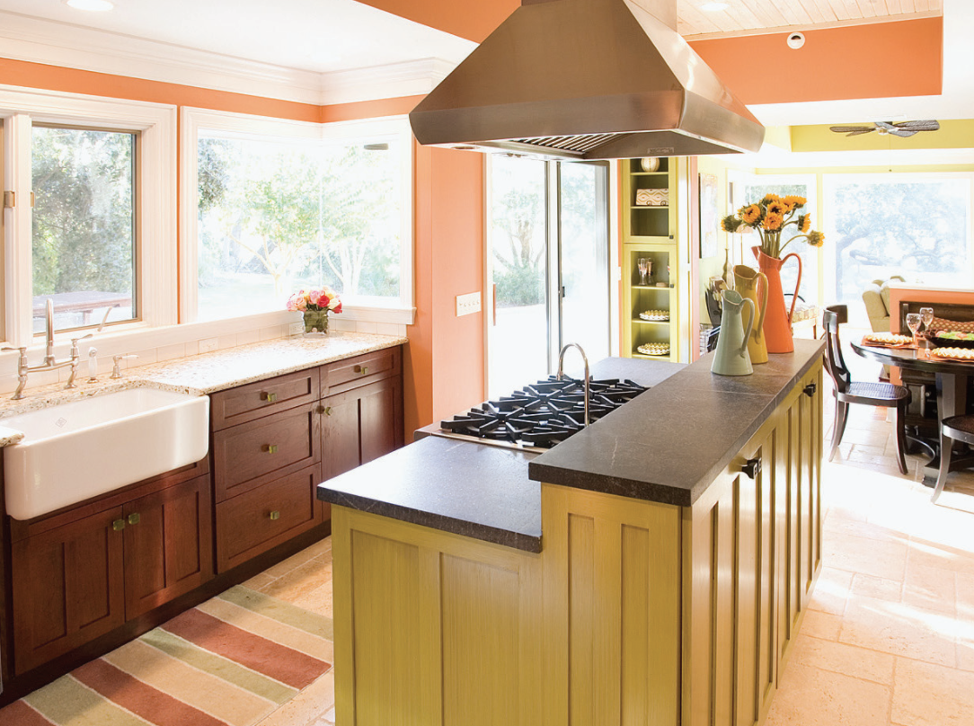
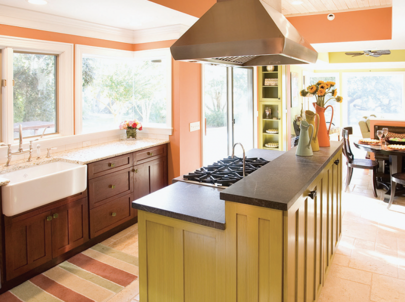
Yellow: This high-energy hue has long been associated with happiness and livelihood. However, long term exposure to deeply saturated yellows can cause hunger and irritation. Yellow, especially bright yellow, is best used as an accent color in all areas of the home. Additionally, yellow has been known to spark creativity – use it in as an accent in a home office or studio.
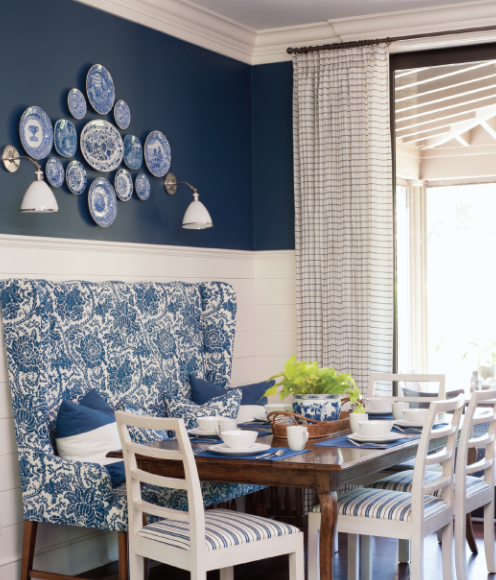
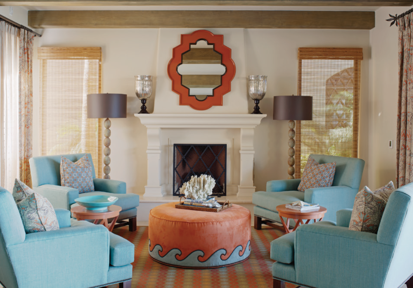
Blue: This oceanic color evokes serene emotions and creates a calming effect. Shades of blue are commonly found in bedrooms, bathrooms, and living spaces used for relaxation. This hue has also been said to calm cravings and suppress appetite.
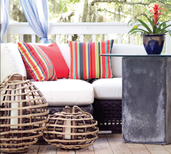
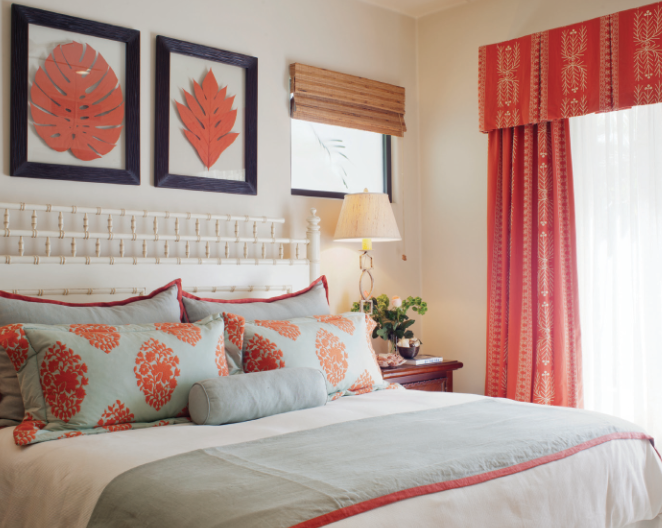
Red: A color of passion, red evokes emotions of love, heat, and danger. This hot hue grabs your attention and does not let go. In addition, red stimulates appetite. Use it in the kitchen or dining room to promote healthy appetites or in the bedroom to spark sensuality. On the flip side, you may want to avoid red in the bedroom and bathroom, where you may want to relax; and in the kitchen, too, because energizing hues can boost your appetite and lead to weight gain!
So now, the question is yours……“what’s your favorite color?” Seemingly arbitrary, we hope you now realize that your favorite color can actually serve as the key to unlock our deepest senses of self. By surrounding yourself with colors that speak to your personality, you’ll be more productive, more at peace, and more “you”!
Use Colors Effectively
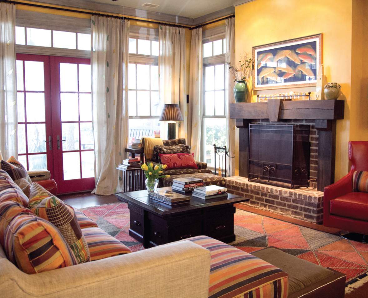
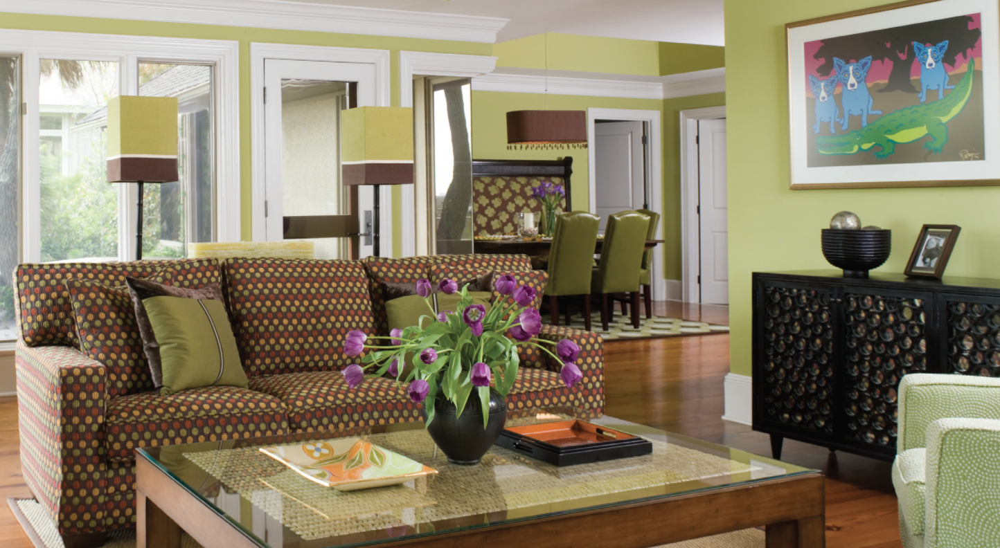
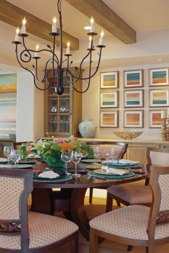
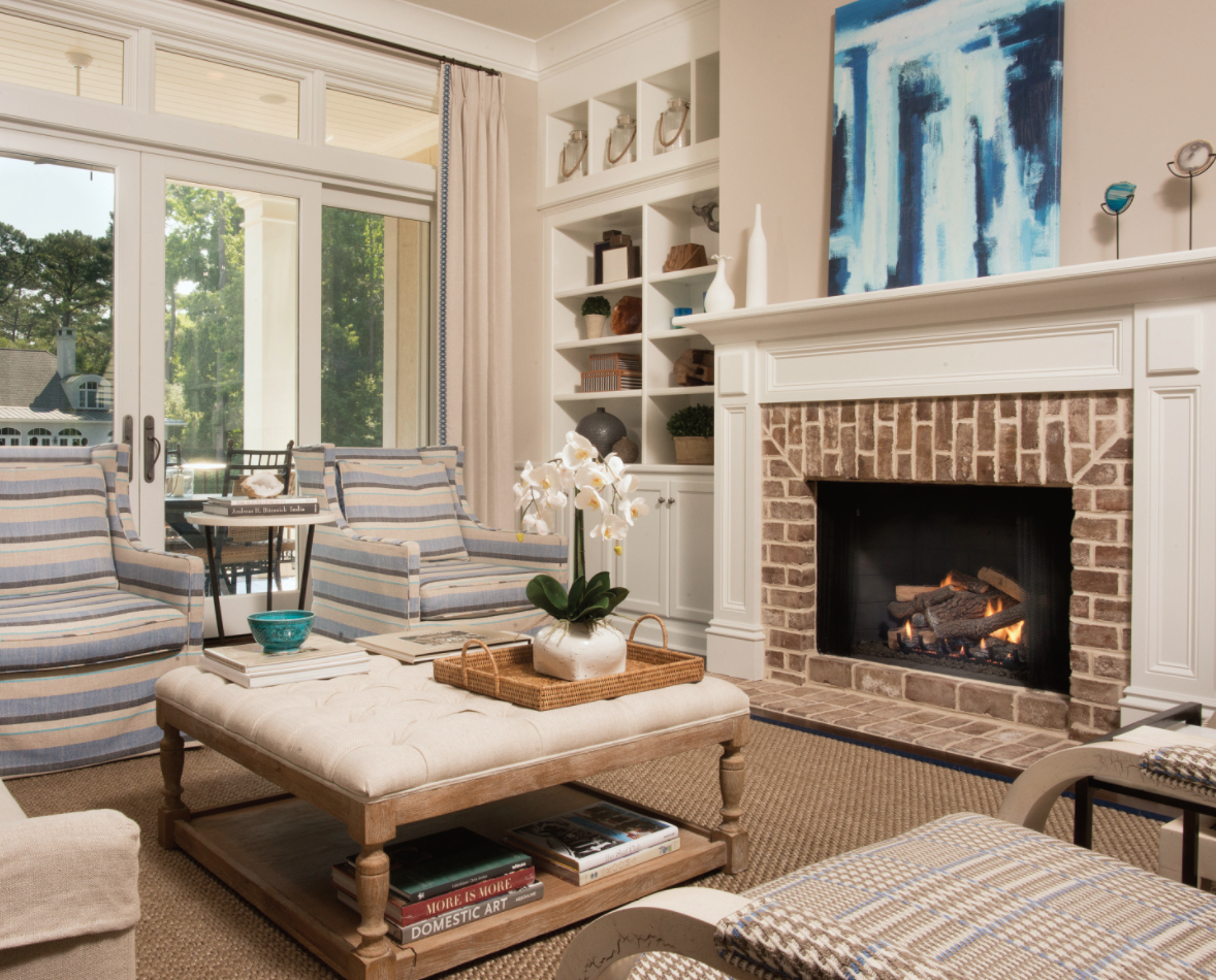
• Don’t let a dominant color over power your space. Stick to 60% main color, 30% secondary color and 10% accent color.
• Choose a color scheme and stick to it. Make sure colors coordinate so that there is a visual consistency or connection.
• Choose accessories in the same colors from the different patterns and textures in your fabrics to keep the room cohesive.
• Temper bold and warm colors with cool ones.
• If a ceiling seems too high and you’d like to bring the scale down a bit, try using a color that is a shade or two darker than the wall color.
• To visually raise a low ceiling, use a color that’s a shade or two lighter than the wall color.
• Use color to cover up architectural oddities or highlight gorgeous attractions.
• High energy colors are good in home offices, entryways, small sitting rooms, or staircases. However, if you want to feel inspired but not wired, add just a touch here and there.
• Monochromatic interiors are sophisticated and chic when paired with a single accent color – think about the power of the blue and white palette. Stunning, classic and always a great choice!
• Don’t be scared of color. Our designers incorporate pops of color in strategic ways through upholstery, fabric, paint, decorative accessories and even building materials such as tile or granite.